這邊說明一下該怎麼繪製折線圖,首先一樣準備一個 canvas 的標籤:
<canvas id="myChart"></canvas>使用的 code 如下:
var ctx = document.getElementById('myChart').getContext('2d');
var myChart = new Chart(ctx, {
type: 'line',
data: {
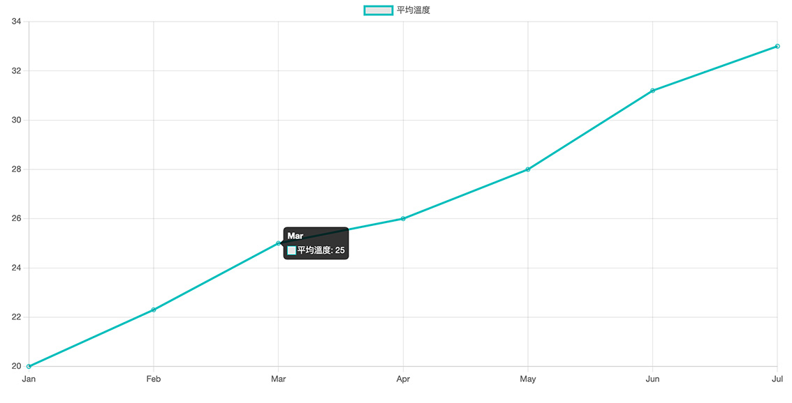
labels: ['Jan', 'Feb', 'Mar', 'Apr', 'May', 'Jun', 'Jul'],
datasets: [{
label: '平均溫度',
data: [20, 22.3, 25, 26, 28, 31.2, 33],
fill: false,
borderColor: 'rgb(75, 192, 192)',
}]
},
});
這樣就可以依據 data 的數值建立折線圖了,其中 labels 是每個值代表的意思,繪製出來會像這樣:
dataset 或 option 要設定的值可以參考官方網站的說明:


![[Three.js] 概述與第一個範例](/assets/upload/1588391477297_0.png)


![[jQuery] 跳離 $.each 迴圈的方法](/assets/upload/1588088792122_0.jpg)

